
Chapter 11 ggplot2
Basic R has multiple, separate functions, each used for creating a specific type of representation: boxplot, histogram, scatter plot etc. ggplot2 is an R package for creating elegant data visualization using the conceptual philosophy that views a plot as the assembly of different fundamental parts: \[Plot = Data + Aesthetics + Geometry\]
- Plot: the final graphics
- Data: tabular data in tibble or a data frame
- Aesthetics: Describe visual characteristics that represent data (position, size, color, shape, transparency, fill, scales
- Geometry: defines the graphical representation: histogram, boxplot, scatter plot. Defines the type of geometric objects that represent data (points, lines, polygons.)
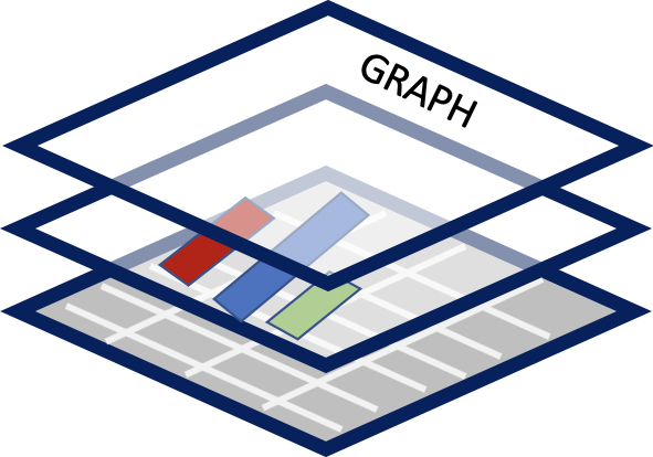
Figure 11.1: ggplot2 constructs graphs in layers using a grammar of graphics.
Each element is built as a layer based on a “grammar of graphics” all assembled into a final plot.
The “grammar” contains more definitions for graphics elements
- coordinate system: e.g. Cartesian, polar, map projections
- geoms: describe type of geometric objects that represent data (points, lines, polygons
- aesthetics: describe visual characteristics that represent data (position, size, color, shape, transparency, fill.)
- scales: for each aesthetic: log scales, color scales, size scales, shape scales.
- stats : describe statistical transformations that typically summarize data: counts, means, medians, regression lines.
- facets: describe how data is split into subsets and displayed as multiple, separate small graphs.
- Theme: controls appearance of non-data elements
Excerpts from Hadley Wickham’s “ggplot2: Elegant Graphics for Data Analysis” (Wickham and Sievert (2016).) (The most revised version of the book is also available free online: ggplot2-book.org/)
ggplot2 is an R package for producing statistical, or data, graphics, but it is unlike most other graphics packages because it has a deep underlying grammar. This grammar, based on the Grammar of Graphics (Wilkinson 2005), is made up of a set of independent components that can be composed in many different ways. This makes ggplot2 very powerful because you are not limited to a set of pre-specified graphics, but you can create new graphics that are precisely tailored for your problem.
Without the grammar, there is no underlying theory, so most graphics packages are just a big collection of special cases.
In his 2017 presentation Hadley Wickham mentions thatggplot was created before Tidyverse and lacks the Tidyverse philosophy on the ideas of distinguishing and separating command (action) and query (computation) functions.(See references in 8.) However it is well integrated within the Tidyverse and can be placed at the end of a %>% pipeline as the last command.
11.1 Tutorials
There are many tutorials online to learn how to use ggplot.
See Appendix G for a table of just a few that seem useful based on the number of examples with ggplot code. There are many more to be found with a simple web search.
Readers are encouraged to learn how to use ggplot2() on some of the provided links in Appendix G before continuing with the examples in the next section 11.2.
One suggestion is The Complete ggplot2 Tutorial34 split over multiple documents.
IMPORTANT CONSIDERATION: Regardless of the chosen online tutorial, your data may not be in the same shape (rows/columns) or have the same attributes (numerical, continuous, categorical) that may make converting online examples to fit your data challenging and frustrating. Being aware of that fact may certainly help!
If the data you are working with is not “tidy” watching the lesson on the tidyr package might be helpful - see data wrangling section 9.
Perseverance is always rewarded.
A personal example:
- A bar chart can be created by two types of
geom:geom_bar()andgeom_col(). This simple knowledge can save you hours of frustration (see help with?geom_bar().) - Categorical variables are usually recognized automatically, but numerical and continuous variables have to be “made” into categories (or “levels”) by using
as.factor()but in some casesas.character()might also work depending on the variable in question.
11.2 ggplot2 using dplyr chapter results
The dplyr chapter ended with the creation putting together a pipeline to create a summary data table. The story will continue here as that chapter ended.
11.2.1 Barplot with qplot / ggplot
Splitting the pipeline above is most useful for using qplot or ggpolot.
Example 2 pipeline at midpoint before summarization, saved in object Mid. It is the same code as above but stopped where the midpoint was suggested.
Mid <- Master4 %>%
# select columns
select(SEQN, RIAGENDR, RIDAGEYR, LBXMFOS, URXUCR, LBXTC ) %>%
# fitler all rows to remove NAs
drop_na() %>%
# Creatinine adjustment
mutate (RATIO = (LBXMFOS/URXUCR)*10^-4) %>%
# categorize ages in  5 groups:
#  Children: G0TO18, younger adults: G19TO35,
# and older adults: G36TO65, seniors: G66TO79,
# and 80 and older: G80.
mutate(AGEGROUP = ifelse(RIDAGEYR %in% 0:18, "G0TO18",
                ifelse(RIDAGEYR %in% 19:35, "G19TO35",
                        ifelse(RIDAGEYR %in% 36:65, "G36TO65",
                               ifelse(RIDAGEYR %in% 66:79,
                                      "G66TO79", "G80")))))
Below are some plot examples using Mid. The addition of facet_grid splits the data “as a function of” (~) gender in RIAGENDR.
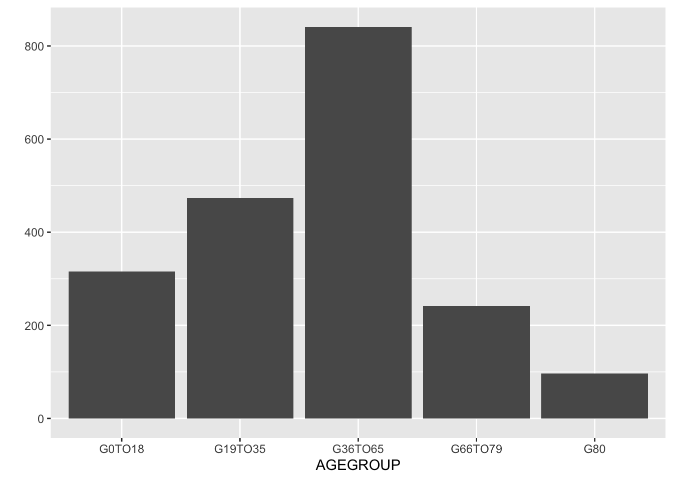
Figure 11.2: Bar plot showing total count by age group without gener distinction.
It would be useful to visualize based on gender, accomplished with the facet_grid() function.
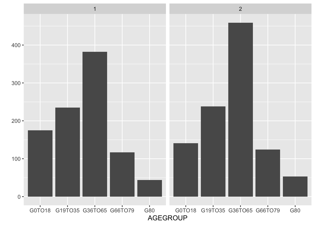
Figure 11.3: With facet_grid() the age distribution by gender is on two separate graphs.
To add color we need to use geom_bar instead of geom = "bar" so that we can add an aesthetics (aes) request to color, as a factor of the values in RIAGENDR.
# Qplot
qplot(x=AGEGROUP,  data=Mid) +
  facet_grid(~RIAGENDR) +
  geom_bar(aes(fill = as.factor(RIAGENDR)))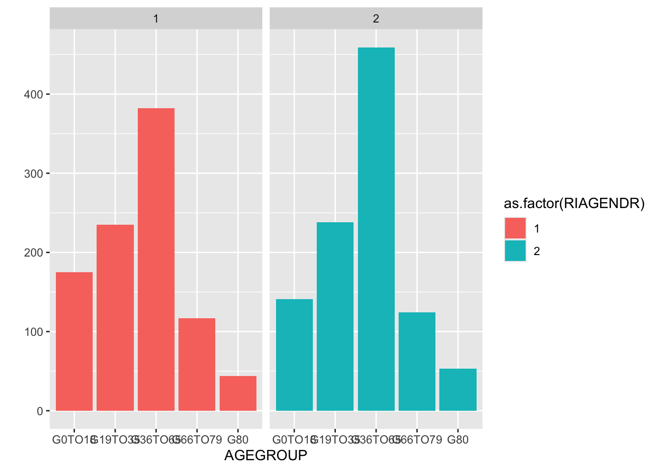
Figure 11.4: With facet_grid() the age distribution by gender on two separate graphs.
A similar plot but with stacked bars can be achieved with ggplot.
We can avoid using as.factor that is necessary since RIAGENDR is coded as a number that ggplot considers a numerical (perhaps continuous) rather than a categorical variable. We could avoid this problem by “recoding” the values of 1 and 2 to words such as male and female or Men and Women on a short pipeline before the plot is done. (Review recode() in section 10.6.)
Mid %>%
  mutate(RIAGENDR =
           recode(RIAGENDR,
                  `1` =  "Men",
                  `2` = "Women")) %>%
ggplot(aes(x = AGEGROUP)) +
  geom_bar(aes(fill = RIAGENDR))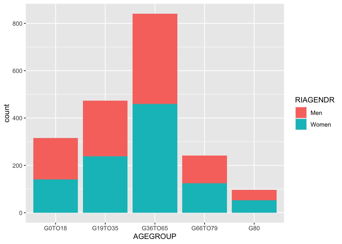
Figure 11.5: Bar plot showng age group distribution by gender. Stack bars is the default.
We now also have a better description, avoiding 1 and 2 as well as as.factor in the legend.
A final touch could be to rename the column RIAGENDR to simply Gender and AGEGROUP to Age group by using the rename() function (section 10.6.)
We can saved this in Mid2. Note the need of quote for Age group to take care of the blank space.
Mid2 <- Mid %>%
    mutate(RIAGENDR =
           recode(RIAGENDR,
                  `1` =  "Men",
                  `2` = "Women")) %>%
    rename(Gender  = RIAGENDR, "Age group" =  AGEGROUP)
Warning: Using blank spaces in columns or in data in general is a source of trouble.
Note that to use the Age group column in a ggplot command it is required to use backticks ` to have it considered a single entity in a similar way that was used in the recode() function with numbers.
To have the bars side by side for each age group the additional position = option is introduced with option "dodge" (bars touch) or "dodge2" (white space between bars.)
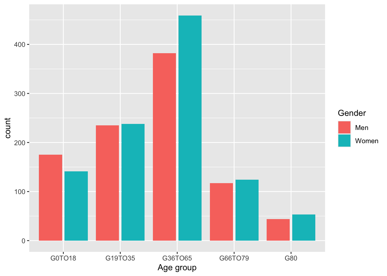
Figure 11.6: Side by side bar of gender count by age group is possible with the dodge or dodge2 options.
It is possible to combine options:
 Mid2 %>%
  ggplot(aes(x = `Age group`)) +
  geom_bar(aes(fill = Gender), position = "dodge2") +
  facet_wrap(~ `Age group`)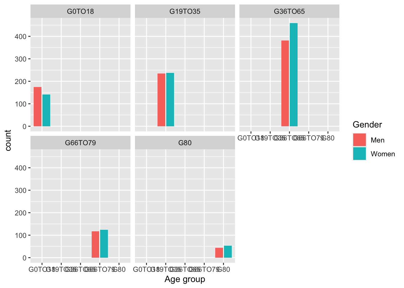
Figure 11.7: Side by side in each facet.
11.2.2 Error bars and meanTChol
Example derived from info at Plotting with ggplot: bar plots with error bars (See also Appendix G.)
We need to use ungroup() as data were grouped when creating Example2. (Section 10.7.2.)
Example2 %>%
# ungroup to allow changes for mutate and rename
    ungroup() %>%
      mutate(RIAGENDR =
           recode(RIAGENDR,
                  `1` =  "Men",
                  `2` = "Women")) %>%
  rename(Gender  = RIAGENDR) %>%
# start ggplot commands
  ggplot(aes(AGEGROUP, MeanTChol)) +
  geom_col(aes(fill = Gender)) +
  geom_errorbar(aes(ymin = MeanTChol - sdTChol,
                    ymax = MeanTChol + sdTChol),
                width=0.3) +
  facet_wrap(~Gender) +
  labs(y="Mean Total Cholesterol ± s.d. (mg/dL)", x = "Age by group")