
Chapter 5 Working with tabular data in R
Before working with your own data, it helps to get a sense of how R works with tabular data from a built-in R data set. We’ll use the data set airquality to do this exploration. Along the way we’ll learn simple functions or methods that help explore the data or extract subsets of data.
In this chapter:
airqualitydataset- Learning base
Rcommands while exploringairquality - Graphical exploration: boxplot and histogram
NOTE
You can search through the pre-installed data sets with the function data().
5.1 Airquality dataset
The airquality dataset is built-in R so there is nothing to install or prepare, it is already there as an R object.
This data is small compared to environmental data sets.
We can learn more about the dataset with the help(airquality) command and we’ll learn that it is Daily air quality measurements in New York, May to September 1973 stored within a A data frame with 153 observations on 6 variables. The source of the data: obtained from the New York State Department of Conservation (ozone data) and the National Weather Service (meteorological data) and cited by Chambers et al. (1985).

Figure 5.1: Datase airquality is a daily record of daily air quality measurements in New York, May to September 1973.
| Column | Name | Type | Details |
|---|---|---|---|
[,1] |
Ozone |
numeric | Ozone (ppb) |
[,2] |
Solar.R |
numeric | Solar R (lang) |
[,3] |
Wind |
numeric | Wind (mph) |
[,4] |
Temp |
numeric | Temperature (degrees F) |
[,5] |
Month |
numeric | Month (1–12) |
[,6] |
Day |
numeric | Day of month (1–31) |
The values are daily readings of the air quality values for May 1, 1973 (a Tuesday) to September 30, 1973.
| Details: Daily readings |
|---|
| Ozone: Mean ozone in parts per billion from 1300 to 1500 hours at Roosevelt Island |
| Solar.R: Solar radiation in Langleys in the frequency band 4000–7700 Angstroms from 0800 to 1200 hours at Central Park |
| Wind: Average wind speed in miles per hour at 0700 and 1000 hours at LaGuardia Airport |
| Temp: Maximum daily temperature in degrees Fahrenheit at La Guardia Airport. |
5.2 Exploring airquality
Base R
This section uses the default R installation. This is sometimes called “base R” and the code may be referred to as “Classic R” as compared to more modern methods that we’ll explore later.
We can look at the first and last few lines of that airquality tabular data. We already know that column names but we can list them with:
colnames(airquality)[1] "Ozone" "Solar.R" "Wind" "Temp" "Month" "Day" Using functions head() and stail() we can show the default of 6 lines of data presented with the column headers:
head(airquality) Ozone Solar.R Wind Temp Month Day
1 41 190 7.4 67 5 1
2 36 118 8.0 72 5 2
3 12 149 12.6 74 5 3
4 18 313 11.5 62 5 4
5 NA NA 14.3 56 5 5
6 28 NA 14.9 66 5 6Both commands can be easily modified to select the desired number of lines:
tail(airquality, 4) Ozone Solar.R Wind Temp Month Day
150 NA 145 13.2 77 9 27
151 14 191 14.3 75 9 28
152 18 131 8.0 76 9 29
153 20 223 11.5 68 9 30In both cases we see that some data is missing, as represented by NA. It is often important to know about missing data and many functions provide default and optional arguments to deal with that.
We can use the function colSums() to easily report the existance and number of NA for each column:
colSums(is.na(airquality)) Ozone Solar.R Wind Temp Month Day
37 7 0 0 0 0 We can get an idea of the size of the table with the function that prints its dimensions:
dim(airquality)[1] 153 6Interestingly the length is the number of columns:
length(airquality)[1] 6We can also check the structure of the dataset with:
str(airquality)'data.frame': 153 obs. of 6 variables:
$ Ozone : int 41 36 12 18 NA 28 23 19 8 NA ...
$ Solar.R: int 190 118 149 313 NA NA 299 99 19 194 ...
$ Wind : num 7.4 8 12.6 11.5 14.3 14.9 8.6 13.8 20.1 8.6 ...
$ Temp : int 67 72 74 62 56 66 65 59 61 69 ...
$ Month : int 5 5 5 5 5 5 5 5 5 5 ...
$ Day : int 1 2 3 4 5 6 7 8 9 10 ...This provides insight telling us that airquality is a of class data.frame, the number of observation, the number of variables, and further details about each variable and the first 10 values in each column.
The summary() function provides a standard stastistical output for each column:
summary(airquality) Ozone Solar.R Wind Temp
Min. : 1.00 Min. : 7.0 Min. : 1.700 Min. :56.00
1st Qu.: 18.00 1st Qu.:115.8 1st Qu.: 7.400 1st Qu.:72.00
Median : 31.50 Median :205.0 Median : 9.700 Median :79.00
Mean : 42.13 Mean :185.9 Mean : 9.958 Mean :77.88
3rd Qu.: 63.25 3rd Qu.:258.8 3rd Qu.:11.500 3rd Qu.:85.00
Max. :168.00 Max. :334.0 Max. :20.700 Max. :97.00
NA's :37 NA's :7
Month Day
Min. :5.000 Min. : 1.0
1st Qu.:6.000 1st Qu.: 8.0
Median :7.000 Median :16.0
Mean :6.993 Mean :15.8
3rd Qu.:8.000 3rd Qu.:23.0
Max. :9.000 Max. :31.0
For each variable (i.e. each column) this provides the minimum and maximum value, the mean, the median. The quartile values divide the number of data points into four more or less equal parts, or quarters.
5.3 Subsetting
It is often desirable to access only some portion of the data. Hence there are ways to select just some columns or rows with the square bracket [] subsetting method.
The first number in the brackets represents the choice of column(s). If there is a second number after a comma , that number represents the choice for row(s). Omitting a number means that we want the whole. Here are useful examples adapted from “Introduction to R”13.
SUBSETTING
Take the time to explore the following commands:
airquality[]       # the whole data frame (as a data.frame)
airquality[1, 1]   # first element in the first column (as a vector)
airquality[1, 6]   # first element in the 6th column (as a vector)
airquality[, 1]    # first column in the data frame (as a vector)
airquality[1]      # first column in the data frame (as a data.frame)
airquality[1:3, 3] # first three elements in the 3rd column (as a vector)
airquality[3, ]    # the 3rd row (as a data.frame)
airquality[1:6, ]  # the 1st to 6th rows, equivalent to head(airquality)
airquality[c(1,4), ]  # rows 1 and 4 only (as a data.frame)
airquality[c(1,4), c(1,3) ] # rows 1 and 4 and columns 1 and 3 (as a data.frame)
airquality[, -1]   # the whole data frame, excluding the first column
airquality[-c(3:153),]  # equivalent to head(airquality, 2)
Here is an example using this method to compute the average temperature (variable Temp) in the 4th column by giving the subset as an argument to the mean() function:
mean(airquality[, 4])[1] 77.88235This notation is useful and does the job. The command could be understood as the English phrase: “take the mean of all the values located in the 4th column of the airquality dataset.”
Another subsetting method typical in R is to use the name of the object and the name of the column separated by a $ sign. For example the column for temperature would be designated as airquality$Temp. So we could also use that notation to compute. This time let’s calculate the median:
median(airquality$Temp)[1] 79Here is another example calling for the summary of just one column, here the Ozone column.
summary(airquality$Ozone) Min. 1st Qu. Median Mean 3rd Qu. Max. NA's
1.00 18.00 31.50 42.13 63.25 168.00 37 However, it may easier to work with the with() function that allows to simply use the column name:
with(airquality, mean(Temp))[1] 77.88235This command could be spoken in English as “working with the dataset airquality calculate the average of the values in the column labeled Temp.”
NOTE:
The more modern methods for working with tabular data is to use the Tidyverse package dplyr as will be explored later.(Section 8.)
5.4 Base R Graphics exploration
R provides useful default plotting mechanisms that are useful to explore the data the most rapidly. Other packages can later be used to make the plots prettier.
Most R graphics functions will have defaults that help provide the most meaningful plot. For example we can ask for a boxplot:
boxplot(airquality)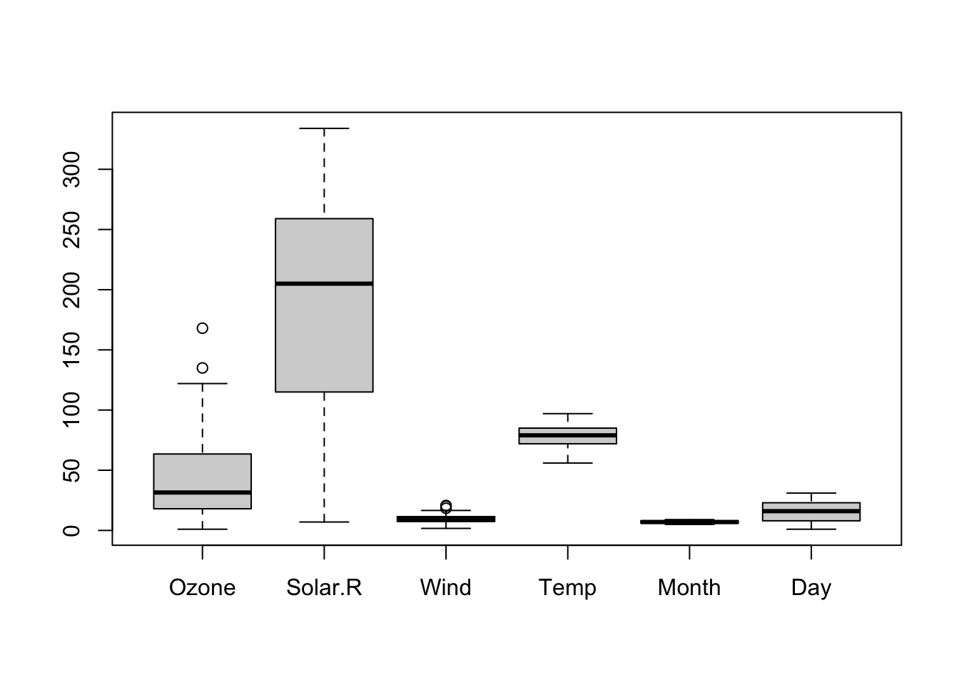
Figure 5.2: Default boxplot of airquality dataset.
The result is alright but it is clear to see that the scale has been chosen to plot the largest values which are from the Solar.R column, therefore “crushing” the other, smaller values.
Let’s compare the results of plotting the temperature from column 4 with the two subsetting methods we just learned. For this we’ll split the graphical page to 1 row and 2 columns first, and then issue the plotting commands:
par(mfrow = c(1,2))
hist(airquality[,4])
with(airquality, hist(Temp))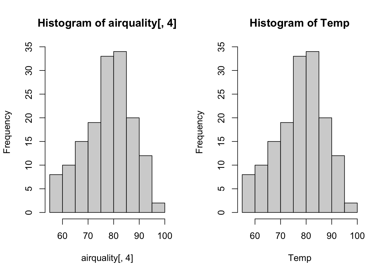
Figure 5.3: Comparing the plot of 2 subset formats.
par(mfrow = c(1,1))We can note that the title of the plot and the name for the horizontal axis reflect what is written within the hist() function. This is just a default. There are ways to change what is written there as detailed in the help.
Now we may rather want to see a boxplot for the temperature.
with(airquality, boxplot(Temp))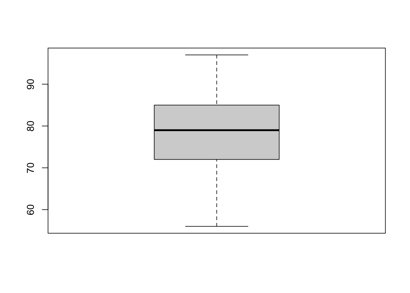
Figure 5.4: Boxplot of temperature of airquality dataset.
This is not super informative, and simply is a larger version of just the Temp values seen in figure 5.2.
5.5 Boxplots
I would be more interesting to plot the temperature separately for each month. This is possible by adding one more term that specifies that we want to “plot temperature as as function of the month.” This is accomplished with the tilde symbol ~ between the two variables that be be read in English with the phrase “as a function of.”
with(airquality, boxplot(Temp ~ Month))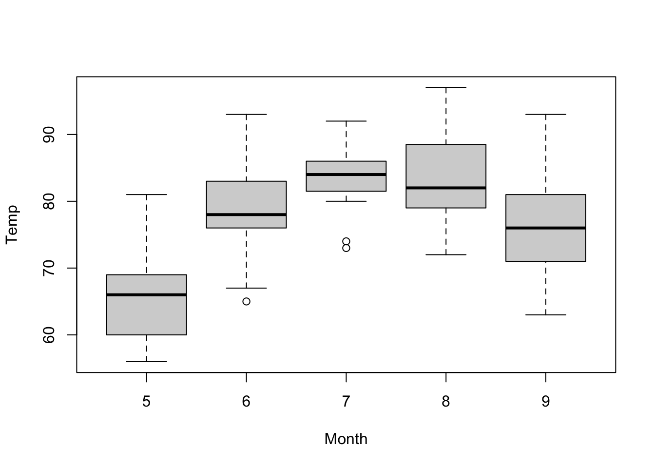
Figure 5.5: Boxplot of temperature as a function of the month of airquality dataset.
It would be possible to add a color, choosing from the default 9 colors in R that are numbered 0-8. 0 is the default white. The next colors have also a name that can be printed by the palette() function:
palette()[1] "black" "#DF536B" "#61D04F" "#2297E6" "#28E2E5" "#CD0BBC" "#F5C710"
[8] "gray62" Therefore we could color the boxes individually by simply specifying a vector of number as we learned to do with the combine c() function:
with(airquality, boxplot(Temp ~ Month, col = c(1,2,3,4,5)))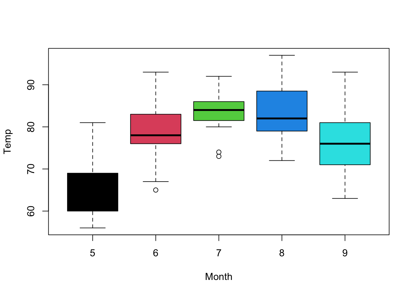
Figure 5.6: Boxplot of temperature as a function of the month of airquality dataset with simple colors.
This can help to understand the notion of factor, used for categorical variable stored it as levels. We can force R to consider a variable as.factor and that will also list the different levels of that factor.
with(airquality, as.factor(Month)) [1] 5 5 5 5 5 5 5 5 5 5 5 5 5 5 5 5 5 5 5 5 5 5 5 5 5 5 5 5 5 5 5 6 6 6 6 6 6
[38] 6 6 6 6 6 6 6 6 6 6 6 6 6 6 6 6 6 6 6 6 6 6 6 6 7 7 7 7 7 7 7 7 7 7 7 7 7
[75] 7 7 7 7 7 7 7 7 7 7 7 7 7 7 7 7 7 7 8 8 8 8 8 8 8 8 8 8 8 8 8 8 8 8 8 8 8
[112] 8 8 8 8 8 8 8 8 8 8 8 8 9 9 9 9 9 9 9 9 9 9 9 9 9 9 9 9 9 9 9 9 9 9 9 9 9
[149] 9 9 9 9 9
Levels: 5 6 7 8 9We can the refine the command to ask for just the levels:
levels(with(airquality, as.factor(Month)))[1] "5" "6" "7" "8" "9"With this knowledge we could now color the boxplot without having to type specific colors, or know how many to use by specifying that we want to color by level:
with(airquality,
     boxplot(Temp ~ Month,
             col = levels(with(airquality,
                               as.factor(Month)))))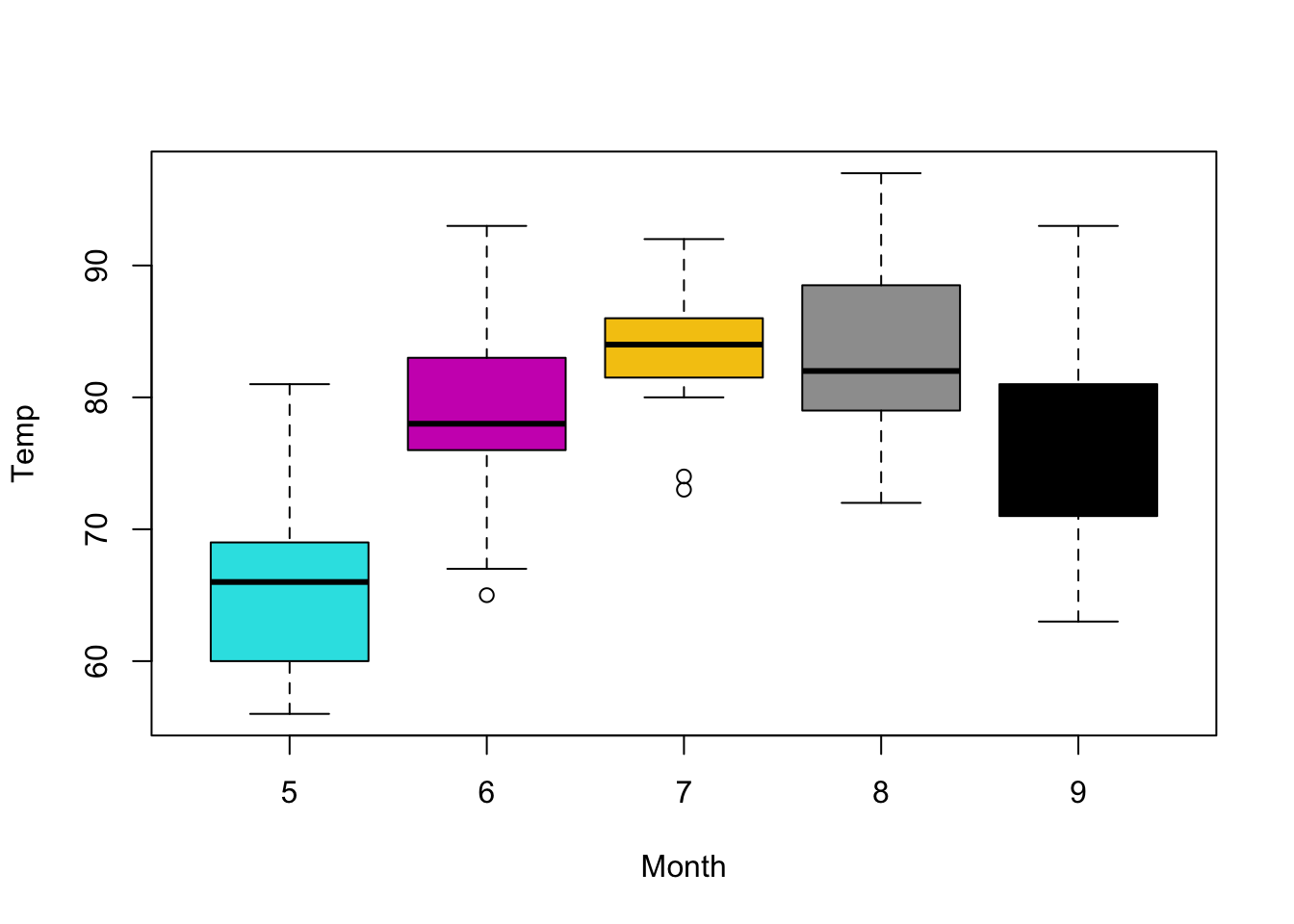
Figure 5.7: Using levels to automatically color boxplot.
Since the levels are 5, 6, 7, 8, 9 the colors of this plot are different than the plot in figure 5.6. Of course this command is not easy to understand as it is. It is usual to create intermediate varibables to make the code easier to read. For example we could create a variable called MyCol to contain the levels.
5.6 Scatter plots
Another type of useful plot is a scatter plot where “points” with an “\(x\)” and a “\(y\)” coordinates are plotted. For example we could plot the Ozone levels as a function of the temperature Temp. This can be written using the with() function:
with(airquality, plot(Ozone ~ Temp))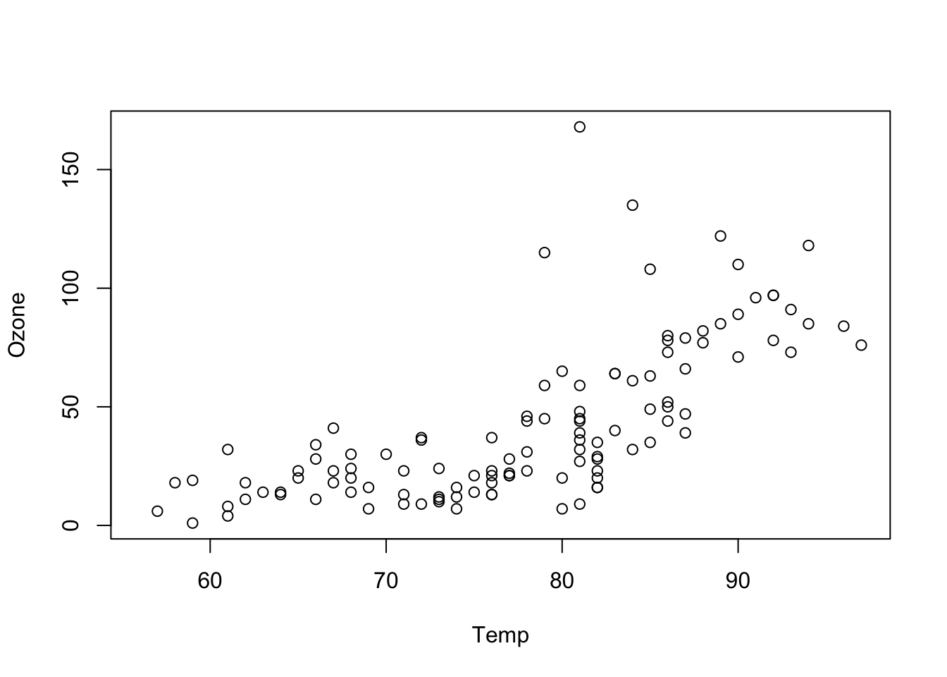
Figure 5.8: A scatter plot can show trend.
As we did with the boxplot we could also color each circle as a function of the month. We could also change the circle with another geometrical form also based on the month. Typically, to avoid “crowded” commands with too many things going on, it is best to decompose the options on separate commands.
All we need to do is assign the levels of the months into a separate variable or a user-defined R object we can call mlev for “month levels” for example:
mlev <- levels(with(airquality, as.factor(Month)))This command extracts the level values but the mlev is of class character and contains 5, 6, 7, 8, 9 which are just the numbers shown as characters.
We have seen that for the plot() function the color option is called col. For the shape option it is called pch which stands for print character. We can use those values to change both the color and the character to be displayed:
with(airquality, plot(Ozone ~ Temp,
                      pch = mlev,
                      col = mlev))
Figure 5.9: Adding month levels both as color and number plotted.
To make use the values within mlev to change the geometric shape we can also force them as a numeric value:
with(airquality, plot(Ozone ~ Temp,
                      pch = as.numeric(mlev),
                      col = mlev))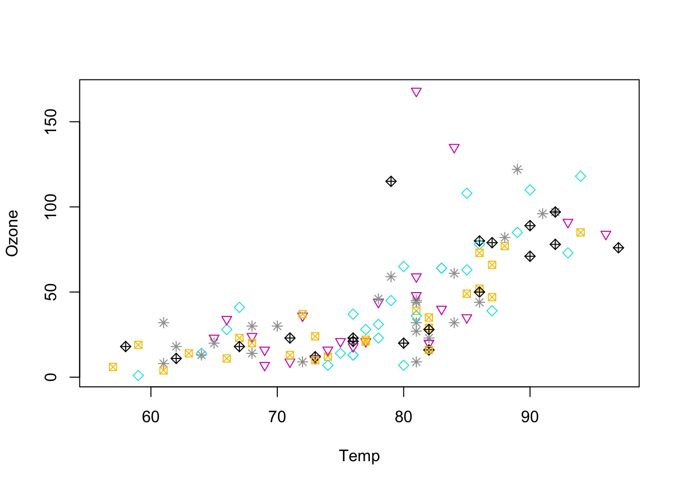
Figure 5.10: Adding month levels both as color and number plotted.
This will call one of the predefined geometric plot characters built in R.
Plot symbols
There are 26 default geometric symbols in R called with pch= option. Points can be omitted from the plot using pch = NA. pch 21 to 25 are open symbols that can be filled by a color.
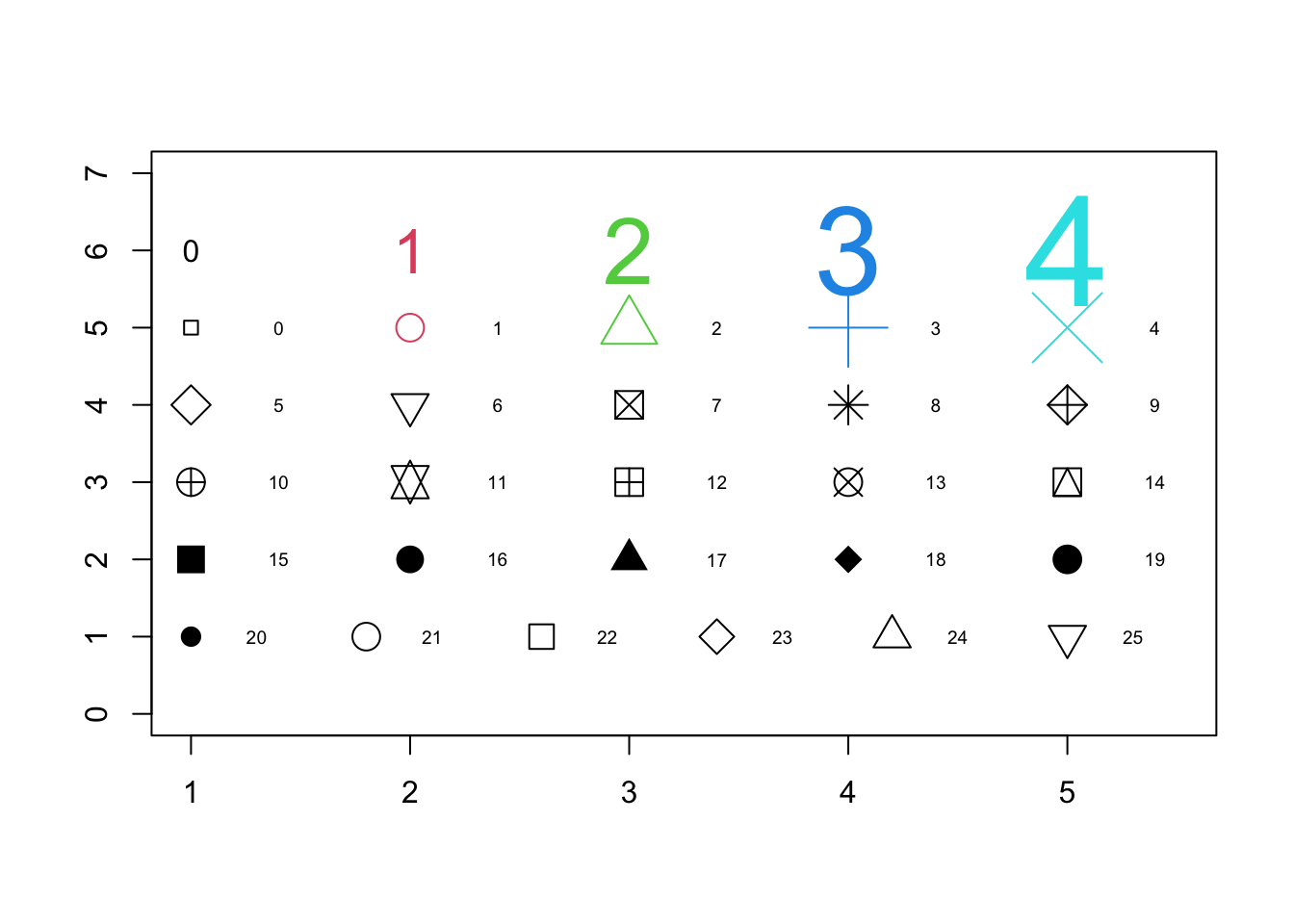
Figure 5.11: 26 pch geometric symbols for plots are numbered 0 to 25. Default is number 1: open circle.
5.7 Simple linear regression
The simple function lm() creates a linear model of the data and will omit NAs if any automatically. For this example it suffices. Other options exists, or computations can ne one to impute the missing data, for example replacing each NA with the average (mean) of all values. The result of lm() is a slope and an intercept which describes a regression line. This can help show a trend, but it is also important to keep in mind that lm() is a simple model and that other regression methods exist.
We can compute a simple regression line for the Ozone vs Temp by providing the values, as in a subset. The most elegant writing is by using the with() function:
model1 <- with(airquality, lm(Ozone ~ Temp))
model1
Call:
lm(formula = Ozone ~ Temp)

Coefficients:
(Intercept)         Temp
   -146.995        2.429
We could use str() on the new model1 object to note that it has a complex structure. Suffice to mention for now that the 2 most important values can also be called with model1$coefficients
We can now add the regression line to the existing scatter plot with the abline() function used to add one or more straight lines through the current plot.
with(airquality, plot(Ozone ~ Temp, pch = mlev, col = mlev))
abline(model1, col = "blue", lwd = 3)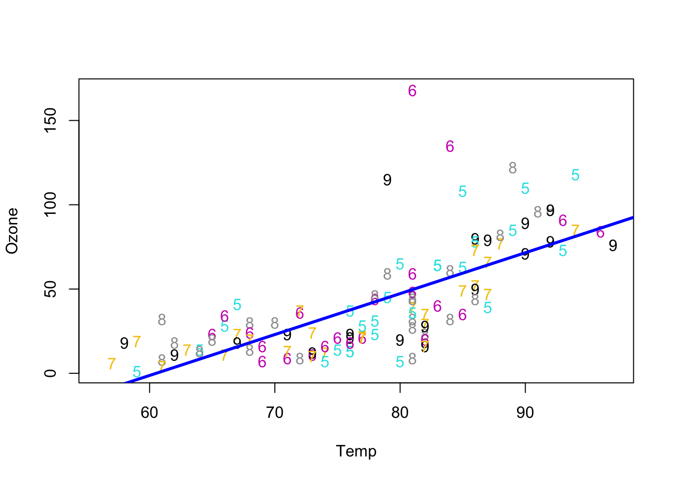
Figure 5.12: Adding the simple regression line on the scatter plot.
Exercise:
We saw that Ozone increases with Temp.
Using a scatter plot and an optional linear model regression can you tell what is the effect of Wind?
5.8 Fancier Graphics exploration
For this section we’ll call on ggplot2 which is a package included in the Tidyverse suite. If you need to install this go to section 1.2 and proceed with the installation.
It may be useful to skip this section and review chapter 11 before spending too much time if this section proves difficult.
The ggplot2 package is now the “new standard” and while it is useful to know the graphics commands from R base, it is becoming more and more important to learn how to use this package.
There is a main command called ggplot() and a somewhat simpler command called qplot() (with a single q) that resembles a little more the graphics commands we saw earlier. (qplot() is short for “quick plot”.)
First we need to activate or load into memory the ggplot2 package. This is accomplished with the library() function.
library(ggplot2)If you have an error make sure that you have previously installed Tidyverse or the single ggplot2 package (see section 1.2.)
5.8.1 Boxplots
Let’s start by trying to reproduce some of the plots with these new commands. Here is how to create a box plot of the temperature (columnTemp) as a function of the month (column Month.) We also need to specify that we want to use Month as the coloring factor. We don’t need to specify that we want the levels as qplot is smart enough to understand that. To obtain a boxplot we ask for a type of plot “geometry”.
qplot(Month, Temp, data = airquality,
      geom = "boxplot", color = as.factor(Month))
Figure 5.13: qplot version of Temperature vs Month.
Note the order of the variables that are written here in reverse order as compared to the Base R commands of figure 5.7.
Exercise 5.1 What would happen if the order of the variables Month and Temp were inverted here?
What about the base R version that created figure 5.7?
Some improvement and tweaking are always possible, but for a first plot it is not bad.
We can improve the plot by transforming some of the data, namely by making the Month variable a factor rather than just a numeric entry as was shown by the str() function in section 5.2.
To avoid making changes to the original data, we’ll copy the airquality data into a new object that we can call aq for simplicity. From that point the original dataset will not be changed and we’ll only affect the aq object.
aq <- airqualityWe can now transform the Month column using one of the subsetting methods we saw previously (section 5.3.) Both aq$Month and aq[, 5] would work. The following command will overwrite the Month column with its modified status as a factor. The command q$Month <- factor(aq$Month) would provide the factor definition. But we can add a modification that will change the “label” of the factors from numbers to the name of the month in the calendar thanks to the month.abb parameter that can convert the month number into an abbreviated English name.
aq$Month <- factor(aq$Month,
                   levels = 5:9,
                   labels = month.abb[5:9],
                   ordered = TRUE)
Let’s see if that worked with some test commands for both aq and airquality:
# class
class(airquality$Month)
[1] "integer"class(aq$Month)[1] "ordered" "factor" # levels
levels(airquality$Month)NULLlevels(as.factor(airquality$Month))[1] "5" "6" "7" "8" "9"levels(aq$Month)[1] "May" "Jun" "Jul" "Aug" "Sep"We can now redo the plot:
qplot(Month, Temp, data = aq, geom = "boxplot", color = Month) +
  theme(legend.position = "none")
Figure 5.14: Better qplot version of Temperature vs Month.
Exercise 5.2 Exercise
Create 4 plots of boxplot on a single page colored by month for the following:
- Ozone vs Month
- Solar.R vs Month
- Temp vs Month
- Wind vs Month
Unlike Base R graphics the par(mfrow = c(2,2)) command would not do the job.
For this we need to rely on a newer package that helps publish ggplot style graphics.
Therefore we need to install the package ggpubr for example with command install.packages("ggpubr") (dependent packages will also be updated.) From this package, the function ggarrange() can be used to list the plots sequentially, specifying the number of rows and columns on the final page at the end. We can also optionally add large labels.
library(ggpubr)

ggarrange(
qplot(Month, Ozone, data = aq, geom = "boxplot", color = Month),
qplot(Month, Solar.R, data = aq, geom = "boxplot", color = Month),
qplot(Month, Temp, data = aq, geom = "boxplot", color = Month),
qplot(Month, Wind, data = aq, geom = "boxplot", color = Month),
labels = c("A", "B", "C", "D"),
ncol = 2, nrow = 2)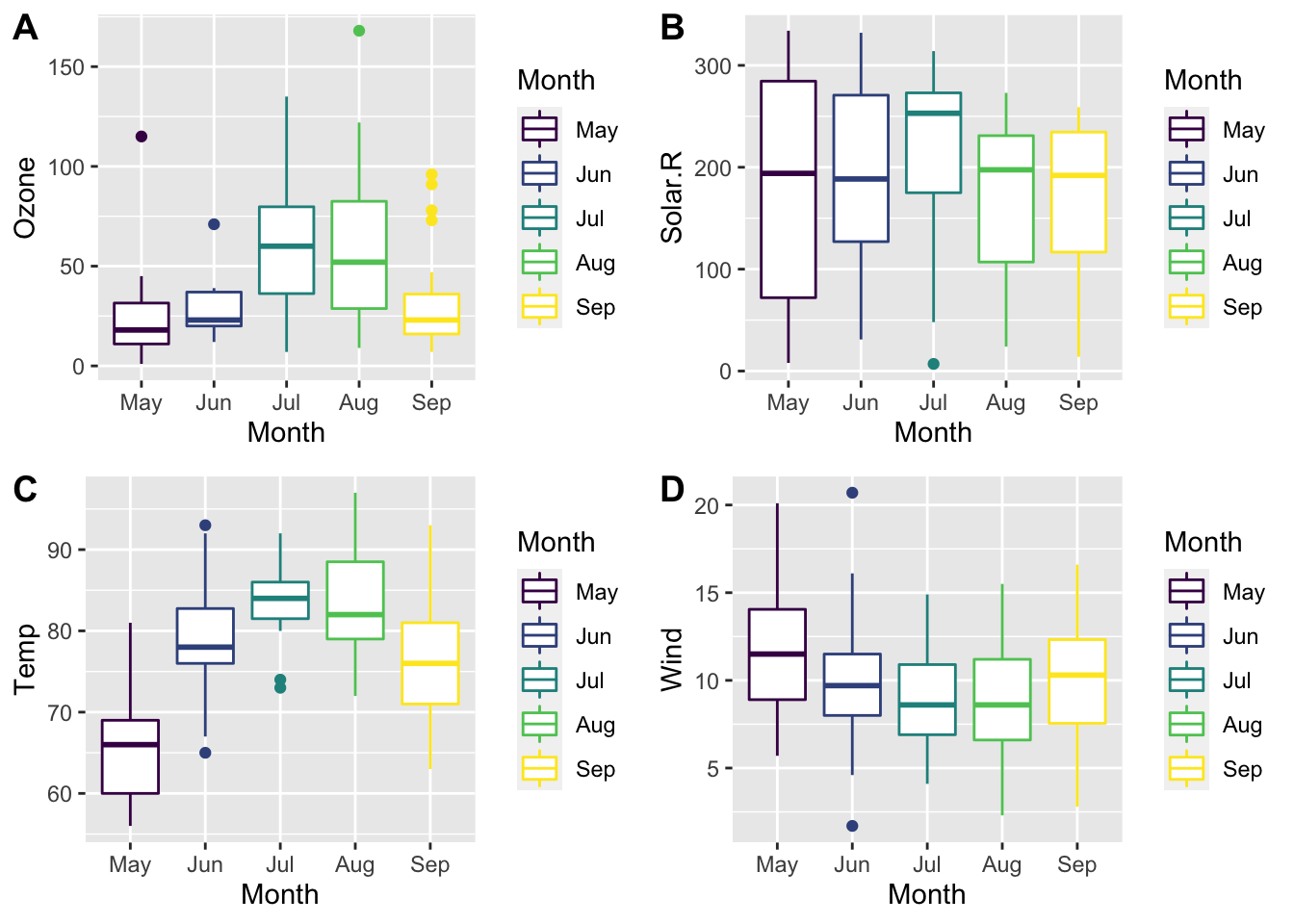
In this example the legend is repetitive and could be omitted from at least 3 of the plots. This can be accomplished by adding + theme(legend.position="none") for each of the plots for which we want to remove the legend. For example:
qplot(Month, Temp, data=aq, geom="boxplot", color=Month) + theme(legend.position="none")
5.8.2 Scatter plots
We can also create a scatter plot easily. Remember that we made Month a factor above (5.8.1.)
qplot(Temp, Ozone, data = aq, col = Month)Warning: Removed 37 rows containing missing values (geom_point).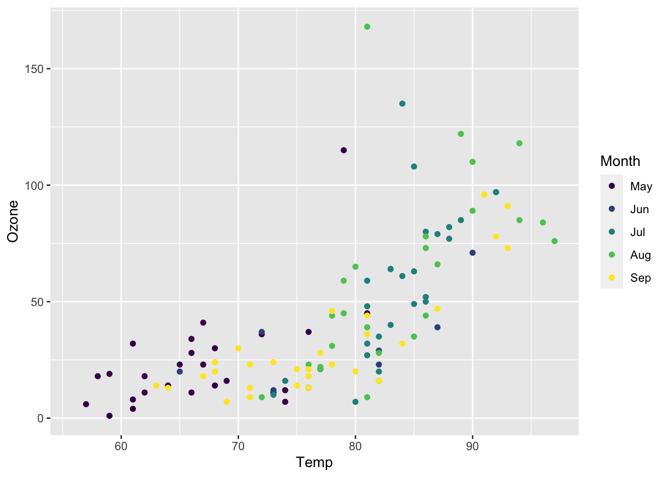
Figure 5.15: Scatter plot for Ozone vs Temperature.
We can also add a linear regression which will be calculated directly by specifying the method as "lm". Since Month is a factor the linear regression will be calculated separately for each month automatically. The SE option is a request to not print the standard error that would make the plot cluttered.
qplot(x = Temp, y = Ozone, data = aq,
      col= Month,
      geom = c("point", "smooth"),
      method = "lm",
      se = FALSE)
`geom_smooth()` using formula 'y ~ x'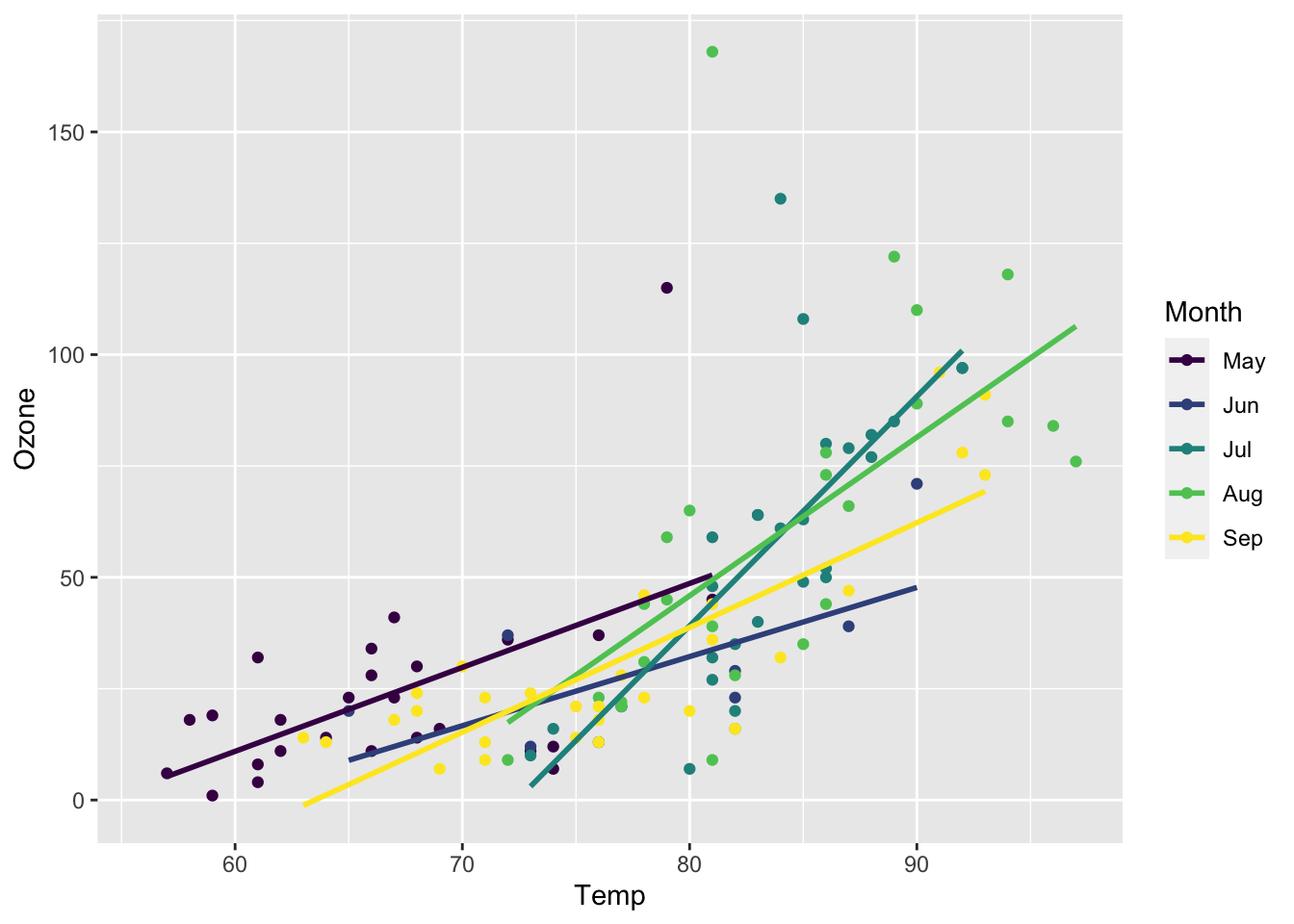
Figure 5.16: Scatter plot for Ozone vs Temperature, linear regression for each month.
To compute the linear regression as we did with the classic R plot all we need to do is to specify that we want to use month as a numeric value. We can also now turn SE to TRUE if we wish:
qplot(x=Temp, y=Ozone, data=aq,
      col=as.numeric(Month),
      geom=c("point", "smooth"),
      method="lm",
      se = T)
`geom_smooth()` using formula 'y ~ x'
Figure 5.17: Scatter plot for Ozone vs Temperature. Linear regression for all months.
The result is that the legend now reports Month as a continous data, which is not correct. The legend could removed by adding + theme(legend.position="none") as we saw above.
If we do not specify the method by removing method="lm" we obtain the default, more complex, non linear regression line. In that case the “loess” regression is used.
qplot(x=Temp, y=Ozone, data=aq,
      col=as.numeric(Month),
      geom=c("point", "smooth"),
      se = T) +
  theme(legend.position="none")
`geom_smooth()` using method = 'loess' and formula 'y ~ x'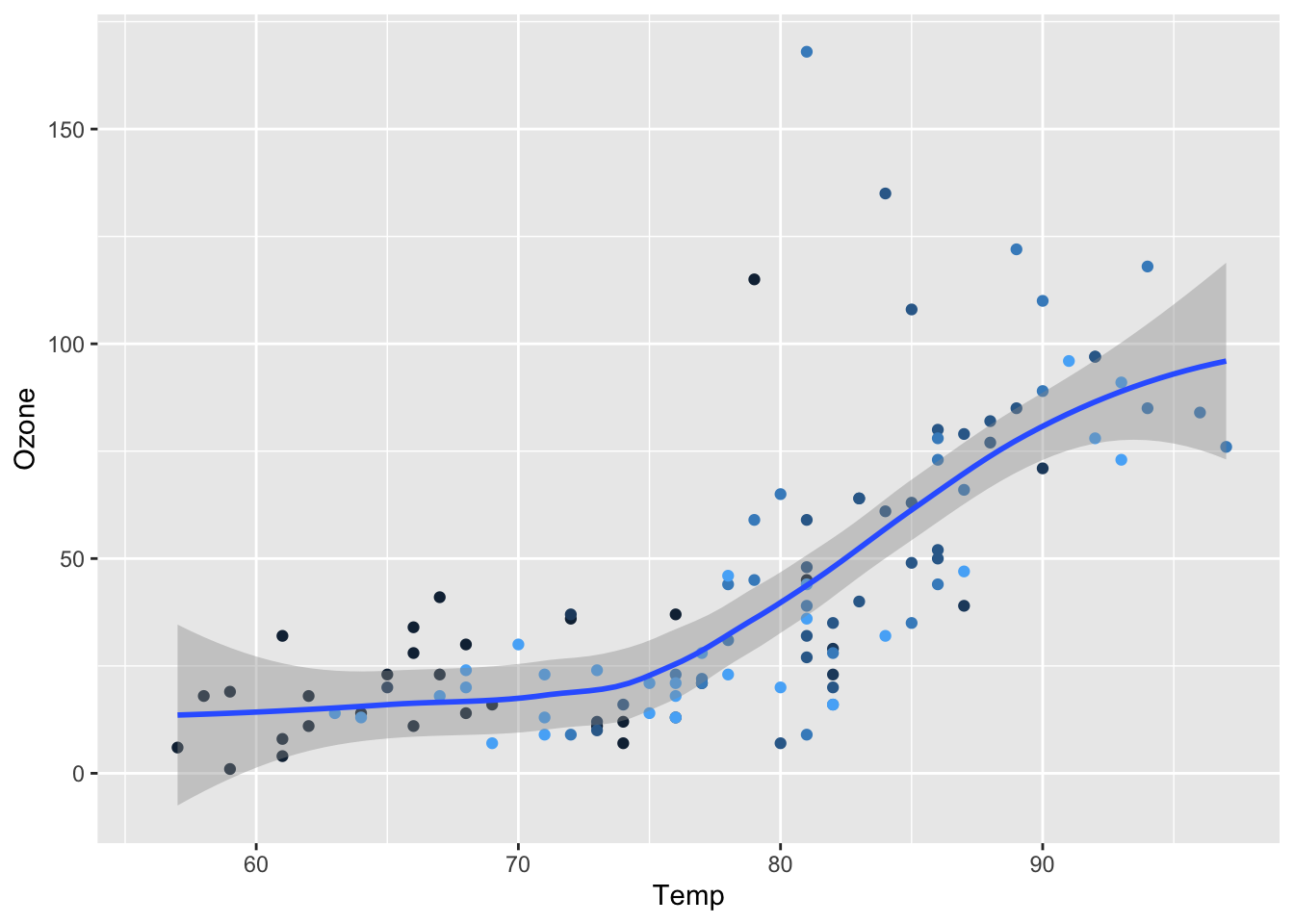
Figure 5.18: Scatter plot for Ozone vs Temperature. Linear regression for all months.
These examples above are to show what is possible with qplot which is the quick plot version of the more fancy ggplot.
Using Internet search is useful to find examples of code that help. For example the linear regression addition was found on this stack overflow page: I need to add linear regression trend lines to qplot14.
